Previous design adventures
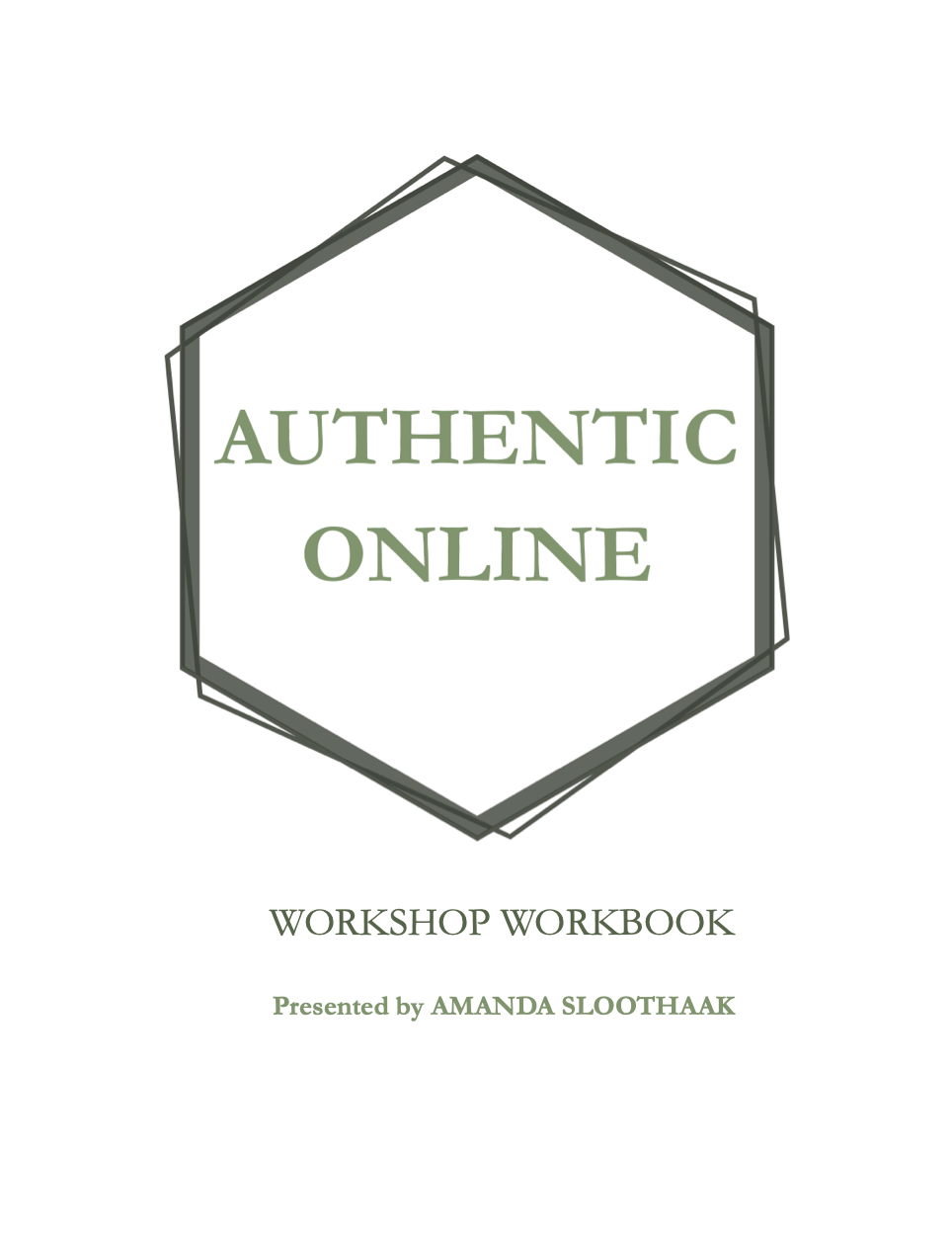
being authentic online workbook layout
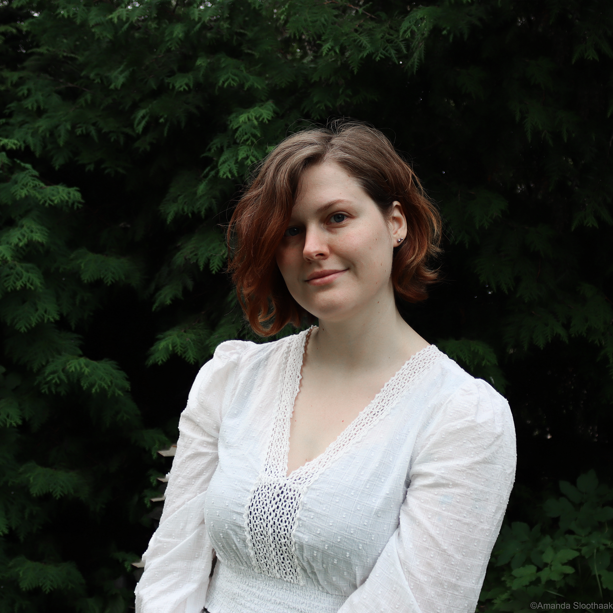
Amanda Sloothaak is a historical fantasy writer from the Netherlands who has released two books in The Myths of the Northern Lands Series.
She was teaching a workshop on how to be authentic online at the Auters Festival in Amsterdam and had a physical workbook she had prepared for in-person participants.
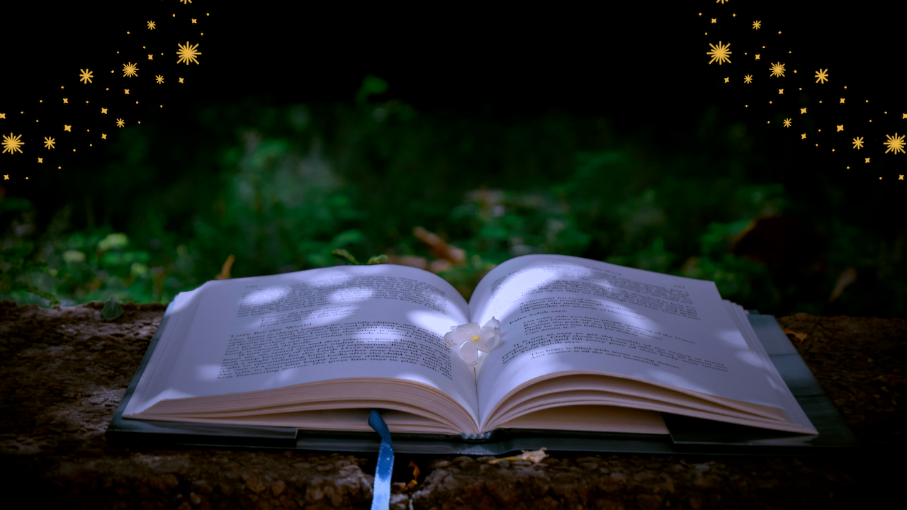
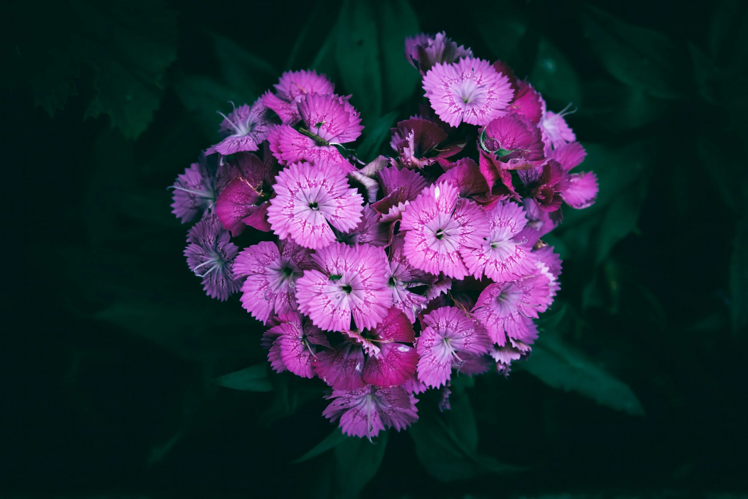
Amanda’s online aesthetic is very nature focused and welcoming but the original design for her workbook had a lot of hard edges that didn’t seem to fit in with Amanda’s personality.
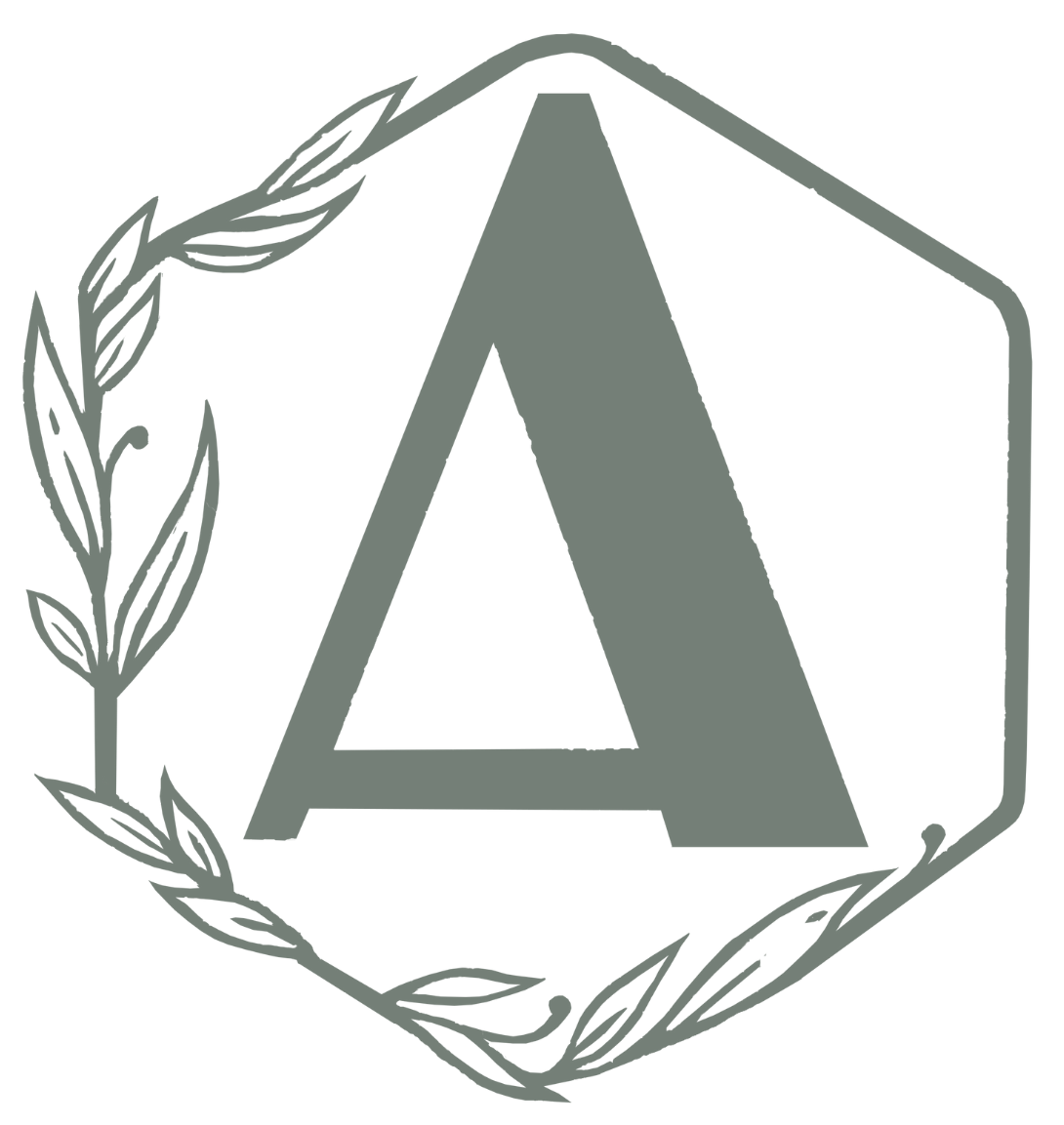
Amanda already had a logo she was using on her website and for publishing her books, so I used it as inspiration for my re-design of her workbook.
My goal for the project was to design a workbook that wasn’t ink heavy since Amanda would be printing the pages at home, while still showcasing the content in a way that expressed Amanda’s authenticity and personality.
I chose fonts that reminded me of leaves on a tree and the strength and sturdiness of tree trunks.
For Amanda’s color palette, I pulled the green and beige colors from her original design but added in a shade of dark brown I pulled from her hair.
The completed workbook kept Amanda’s original simplicity of design intact but felt a lot more in line with her personal branding.
Amanda also hired me to design the layout for the Dutch version of the workbook after it was translated because she was concerned the translation would alter the text layouts.
The translated version ended up being two pages of graphics longer than the original, but because the pages were printed double sided, the actual page count remained the same.
-
Amanda's review
Shannon is amazing to work with, she asks all the questions you won't think of yourself about, keeps you in the loop during the process and helps you to understand why things are done in the way they're done as well as clarifying the process to you.
She communicates really well and has great ideas, she looks at what you already have (website and social media) and can make something that completely fits your aesthetic, or help you figure out your aesthetic if you're not sure about it yet.
The process to create a translated version of the workbook was smooth, consistent and easy to do. Shannon was clear about what would work best when it came to delivering the translated text and it looks so good. A few pages had to be adjusted formatting wise but she did that amazingly and it looks equally pretty to the English version of the workbook she designed. I'm very happy with the results :).
It was a great experience that was also fun because I learned lots of new things too.
Ask the Oracle
Book a free discovery call so we can get you started
down the path to your dream design!